By Cassandra Balentine
Judging a book by it’s cover is easier than ever as publishers utilize embellishments to make them stand out—even in short runs.
Sean Roberts, national director, Industrial Print Group, Konica Minolta, notes a meaningful shift toward embellishment in book cover production. “I would frame it less as decoration and more as market differentiation,” he offers. “Publishers, authors, and brands are competing for attention in a very crowded environment. Whether a book is sitting on a retail shelf, displayed at an event, featured in an influencer post, or sold through an online marketplace, the cover has to create an immediate impression. Clear varnishes, dimensional textures, metallic effects, and tactile finishes help create that moment of engagement.”
The other important factor is run length. Traditional embellishment methods often required longer runs, tooling, dies, plates, and longer setup cycles. Digital embellishment changes that equation as it allows producers to add premium visual and tactile effects to short-run, versioned, personalized, or limited-edition book covers without the same traditional barriers. “We see adoption growing, especially where publishers are trying to create a premium product, improve perceived value, or make a cover feel more collectible,” adds Roberts.
Popular Finishes
Among the most popular effects in book covers include spot UV, raised dimensional varnish, and metallic foils.
Richard Ainge, founder and chief product architect, Khaos Technology — developer of V3R, points out that many modern digital presses now offer metallics, white and clear, and near-line finishing like Duplo and Scodix adds genuine tactile dimension—raised UV varnish, sculptured coating—even on the short runs where traditional foil/emboss tooling wouldn’t pay.
“Embellishment that used to need a long run to justify the setup is now viable copy by copy. With the right method, digital embellishment looks superb—the craft is matching method to design,” shares Ainge.
Roberts says the most popular effects tend to be those that enhance the cover without overwhelming the design. “Spot UV remains one of the most widely used because it is versatile, elegant, and effective. It can highlight a title, author name, logo, image element, pattern, or background detail.”
Raised dimensional varnish is popular because it adds a tactile experience. “Readers do not just see the cover—they feel it. That can be very powerful for premium fiction, children’s books, art books, religious books, photography, self-help, business titles, and special editions,” explains Roberts.
Metallic foils are commonly used for titles, borders, graphic elements, and luxury design cues. Roberts says gold and silver remain classic, but we also see interest in more contemporary metallic colors depending on the genre and brand positioning. Micro textures are an emerging opportunity. They can simulate patterns like leather, fabric, water, geometric textures, or subtle design elements that create depth. The best applications are usually selective and intentional. The goal is not to embellish everything. The goal is to make the right design element impossible to ignore.
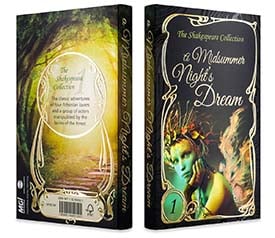
Ainge says foil has signaled value for centuries. “The Bible, the Qur’an, the Torah, and in a secular register Penguin’s Clothbound Classics all reach for it. Digital now lets you reach for that same presence affordably, but it lives or dies on the surrounding design. The attached poetry cover began as white with gold and looked pale and washed out; on a dark background the same raised gold foil commands the page. Nothing changed but the background. You’d catch that in V3R in seconds—or after a wasted proof.”
Ainge stresses that embossing and raised varnish are different tools, not rivals—emboss reshapes the stock. “The thumb-rub you can feel with your eyes shut, raised varnish builds on the surface. Choose by effect.”
There are popularity differences from hardcover versus softcover.
Adoption is different by format, primarily because the economics and expectations are different. Roberts explains that hardcover books, dust jackets, and premium case-bound products tend to justify embellishment more easily. “These products often have a higher retail price, a longer shelf life, or a stronger collectible value. In those cases, the cover is part of the product experience, and embellishment can support the premium positioning.”
Soft cover books can also benefit, but the adoption tends to be more selective. Roberts says for mass-market paperback production, cost sensitivity is higher. However, for short-run books, special editions, author-direct publishing, educational products, graphic novels, children’s books, and premium soft covers, embellishment can be a strong differentiator.
“The biggest change is that digital embellishment allows producers to apply these effects without requiring the same minimum volumes associated with traditional finishing. That opens the door for soft cover applications that may not have been practical in the past,” adds Roberts.
Subject matter also dictates what works, for instance, Ainge point out that “a fingerprint texture in varnish suits a thriller; it’d be wrong on a cookbook.”
Digital Challenges
Adhesion is one of the most important technical considerations in digital embellishment.
Roberts admits that digital inks, toners, coatings, laminates, and substrates all behave differently, so the process has to be managed correctly. “The key is matching the embellishment chemistry, surface preparation, and production workflow to the printed piece. In many book cover applications, embellishment is applied over a laminated or coated surface, which can provide a more consistent and predictable foundation. In other cases, the varnish or foil effect is applied directly over digital print, but that requires proper testing of toner coverage, ink laydown, surface energy, cure conditions, and finishing compatibility.”
This is where production experience matters. Roberts feels it is not just about whether the machine can place varnish or foil. It is about understanding the full stack: print engine, substrate, coating, laminate, embellishment, curing, cutting, folding, binding, and end-use durability. Our role is to help customers validate that workflow so the final product looks premium and performs reliably.
Ainge also suggests avoiding neon/fluorescent inks due to poor lightfastness. “They fade on a shelf. And design for real-world light, a foil that sings under studio light can vanish on a dim shelf.”
Important Developments
The development of solutions like flexible polymers are also relevant to this space.
Roberts says this is an important area for book production because covers are handled, bent, folded, stacked, shipped, and in many cases wrapped around a spine. “For this market, the discussion around polymers is really about flexibility, durability, adhesion, and feel.”
A high-build embellishment has to look impressive, but it also has to survive normal handling. If the effect is too brittle, too thick in the wrong area, or not properly matched to the substrate and finishing process, it can crack, lift, or create issues downstream. “Developments in UV-curable varnishes and flexible polymer formulations are helping expand what is possible. These materials can support dimensional effects while maintaining enough flexibility for covers, jackets, folding areas, and other book-related applications,” offers Roberts.
The practical takeaway is that embellishment design has to consider the entire finished product. “A raised effect on the front cover may behave differently than an effect placed near a fold, hinge, or spine. The technology is advancing, but good application design remains critical,” adds Roberts.
Registration Considerations
Registration around the spine is one of the more challenging areas because it involves both print registration and bindery tolerances.
Roberts points out that the spine area is affected by folding, scoring, trimming, cover wrap, book block thickness, and the accuracy of the binding process. “On our embellishment systems, AI SmartScan technology registers the printed sheet and align the embellishment to the actual image position, rather than relying only on theoretical file placement.”
That is important because even small print or finishing shifts can become visible when embellishment is applied to precise elements. “For spine embellishment specifically, the best results come from designing with production realities in mind. We encourage customers to test spine width, fold placement, scoring, and binding variation before committing to production,” explains Roberts.
In many cases, the most successful approach is to use embellishment to accent the spine while allowing enough tolerance so the design remains clean after binding. “The technology has become very capable, but the strongest results come when prepress, print, embellishment, and bindery are planned as one connected workflow,” states Roberts.
Highlighted Solutions
Konica Minolta plays the role of technology partner with a focus on helping printers, publishers, and trade finishers move embellishment from a specialty outsourced process into a more flexible, digital production workflow.
For book cover applications, we primarily highlight the MGI JETvarnish 3D EVO 75 and the Konica Minolta AccurioShine 3600. The JETvarnish 3D EVO 75 is designed for high-volume digital embellishment, including spot UV, raised dimensional varnish, digital foil effects, and tactile textures. It is especially relevant for book covers, dust jackets, premium soft covers, limited editions, and specialty publishing applications where visual impact and registration accuracy are critical.
The AccurioShine 3600 provides an accessible entry point into digital embellishment, giving printers the ability to add spot UV and foil effects without conventional dies or screens. For commercial printers, small publishers, and short-run book producers, it creates a practical way to test and develop embellished book cover applications.
Roberts says the broader value is that these systems allow embellishment to become part of a digital print strategy, not a separate analog finishing conversation. That matters because the market is moving toward shorter runs, faster turnarounds, and more targeted products.
One step before the press, letting people embrace these options with confidence is Visualis3R. It’s a real-time visualizer—try foil, raised varnish, soft-touch, metallics, including Color-Logic systems; white; ECG color; and textures, on different substrates and lighting, and see how the cover will look before committing to a mockup or proof.
“Put simply, we don’t mind which finish you choose; we help you see whether it will work before you spend. Today that’s the flat cover face; a 3D fold-up book template—spine, hinges and all—is on our roadmap,” shares Ainge.
Fast Growing Digital
Specific to book production, embellishment allows publishers to appeal to visual and tactile senses.
Ainge says the enduring set of finishes—hot foil, soft-touch, spot UV, emboss—now sits alongside a fast-growing digital wave of metallic/silver toner, white, raised UV varnish, digital foil and ECG color.
Sep2026, DPS Magazine